Travel Theme: Contrast

Published by

on

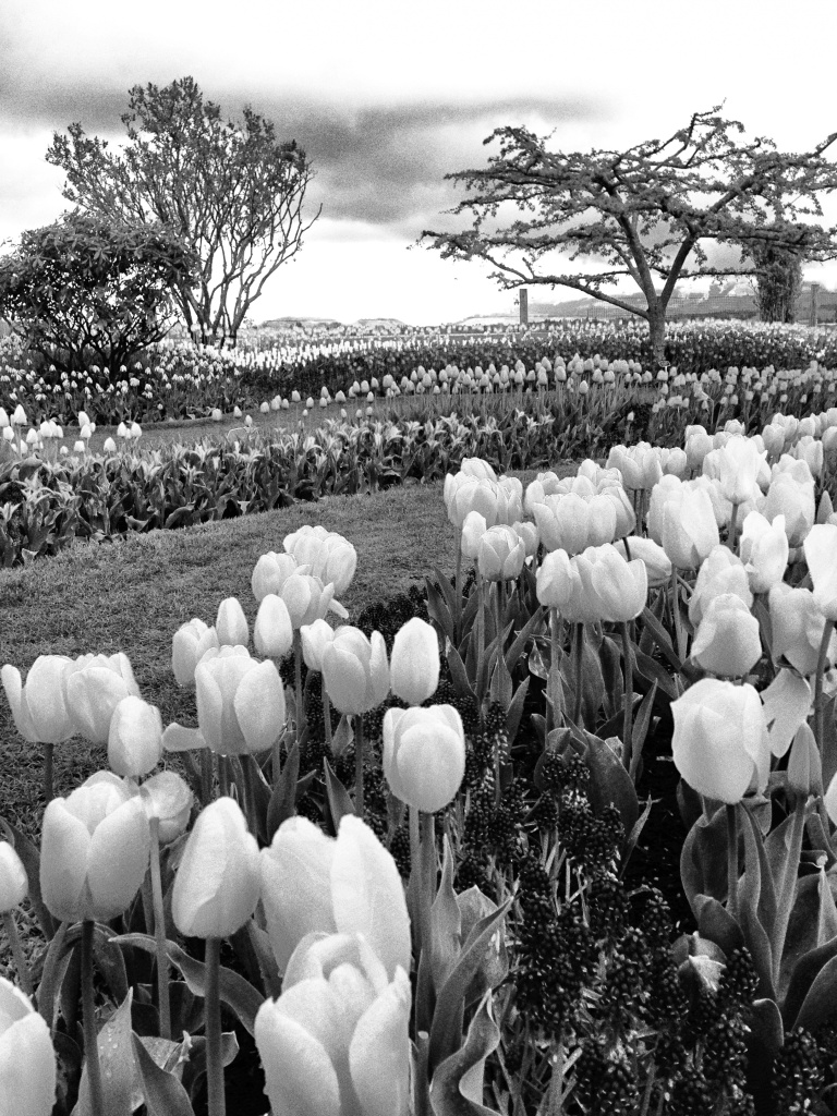
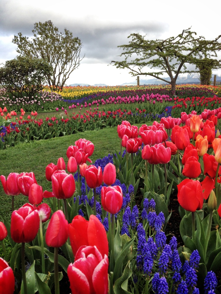
Alisa at Where’s My Backpack has challenged us to share photos that celebrate contrast. A few days ago I posted my first black and white iPhone photo here and the always curious Photography Journal Blog promptly asked if I was going to show the original color version too.  Thanks for the great idea!  I snapped this image with my iPhone 5 during a break in the rain at the Skagit Valley Tulip Festival and I would love to hear your thoughts.  Color or black and white?

Tulips in Color

Skagit Valley Tulips

If you would like to join this travel theme or participate in future challenges please follow Alisa’s directions below:

  • Create your own post and title it Travel theme: Contrast
  • Include a link to this page in your post so others can find it too
  • Get your post in by next Thursday, as the new travel theme comes out on Friday
  • Don’t forget to subscribe to keep up to date on the latest weekly travel themes. Sign up via the email subscription link in the sidebar or RSS.
35 responses to “Travel Theme: Contrast”

  1. bwbears Avatar

    Very nice contrast indeed.
    I like the colors of the first photo.

    Like

    1. NW Frame of Mind Avatar

      Thank you. 🙂 The first one is my favorite too.

      Like

  2. Photography Journal Blog Avatar

    Wow, thanks for posting both and for the mention 🙂 I’m surprised to say that I like the color better. I say surprised because I really like the black and white. Nicely done.

    Like

    1. NW Frame of Mind Avatar

      Thanks! And thank you for the idea. 🙂 I usually go for the color shot and am happy that my black and white choice had its fans too.

      Like

  3. Rosemarie Avatar

    Color!

    Like

    1. NW Frame of Mind Avatar

      🙂

      Like

  4. Elephant in the room Avatar

    I was just browsing through your pictures. I must say you have an eye for exceptional detail. These pictures are indescribable. 🙂

    Like

    1. NW Frame of Mind Avatar

      Thank you, I really appreciate your comment! I had a great time looking through your posts today too. 🙂

      Like

  5. TheLandSlidePhotography Avatar

    Both !

    Like

    1. NW Frame of Mind Avatar

      Aw, thanks! Nice to hear. 🙂

      Like

  6. vastlycurious.com Avatar
    vastlycurious.com

    I NEED MORE TIME!! Such great themes!

    Like

    1. NW Frame of Mind Avatar

      Yes, finding time is the hardest part! Ideas come easily but I don’t have enough time to follow through with all of them.

      Like

  7. vastlycurious.com Avatar
    vastlycurious.com

    Your tulip color picture is fabulous!

    Like

    1. NW Frame of Mind Avatar

      Thanks, it is my favorite too. 🙂

      Like

  8. Jane Wilson Avatar

    What a fab picture. The colours are amazing! Thanks for the like 🙂

    Like

    1. NW Frame of Mind Avatar

      Oh you’re welcome! Thanks for visiting today. 🙂

      Like

  9. Linda Arthur Tejera Avatar

    I just really love tulips and both versions of this photo are amazing.

    Like

    1. NW Frame of Mind Avatar

      Thanks, the tulip fields are incredible. It is hard to take a bad picture there!

      Like

  10. agreco71 Avatar

    Definitely the color pic!

    Like

    1. NW Frame of Mind Avatar

      I’m glad you like it! Thanks for visiting today.

      Like

  11. weekly travel theme: contrast | Musings of a Random Mind Avatar

    […] Travel Theme: Contrast (nwframeofmind.com) […]

    Like

  12. Daryl and Alana Avatar

    They’re both beautiful — but the colour one is so bright and joyful. I choose that one! =)

    Like

    1. NW Frame of Mind Avatar

      Thanks!

      Like

  13. LindaMay Avatar

    I like both versions. The black and white is unexpected so for that reason I think it has something special to offer. You see the shapes and contrasts in black and white.

    Like

    1. NW Frame of Mind Avatar

      I’m happy to hear you like the contrasts in the b & w. You have called out exactly why I chose such a colorful picture to be shown in b & w.

      Like

  14. jingsandthings Avatar

    Both are great in different ways. Why choose between them – enjoy both.

    Like

    1. NW Frame of Mind Avatar

      Great point 🙂

      Like

  15. Cee Neuner Avatar

    Both are divine. The color really pops….but the B&W makes the fields look like they go back further. Wonderful!!

    Like

    1. NW Frame of Mind Avatar

      Thanks for visiting and sharing your comments today! I think they each have their own unique qualities and it has been really fun to hear so many different responses.

      Like

  16. teoteodora Avatar

    How lovely!

    Like

    1. NW Frame of Mind Avatar

      Thank you!

      Like

  17. […] Contrast # 3: Northwest Frame of Mind […]

    Like

  18. ididitforjohnny Avatar

    Both are stunning, but with that much color, you have to go for it!

    Like

    1. NW Frame of Mind Avatar

      Thanks, I loved standing in the middle of all those beautiful colors!

      Like

  19. […] Travel Theme: Contrast (nwframeofmind.com) […]

    Like

Leave a comment

This site uses Akismet to reduce spam. Learn how your comment data is processed.