This week introduces a new element to Lens and Pen by Sally’s Non-Traditional photo challenge – editing and processing using apps. I’ve been wanting to try Waterlogue and as I expected it’s been fun seeing what my photos might look like if I had any talent with watercolor.
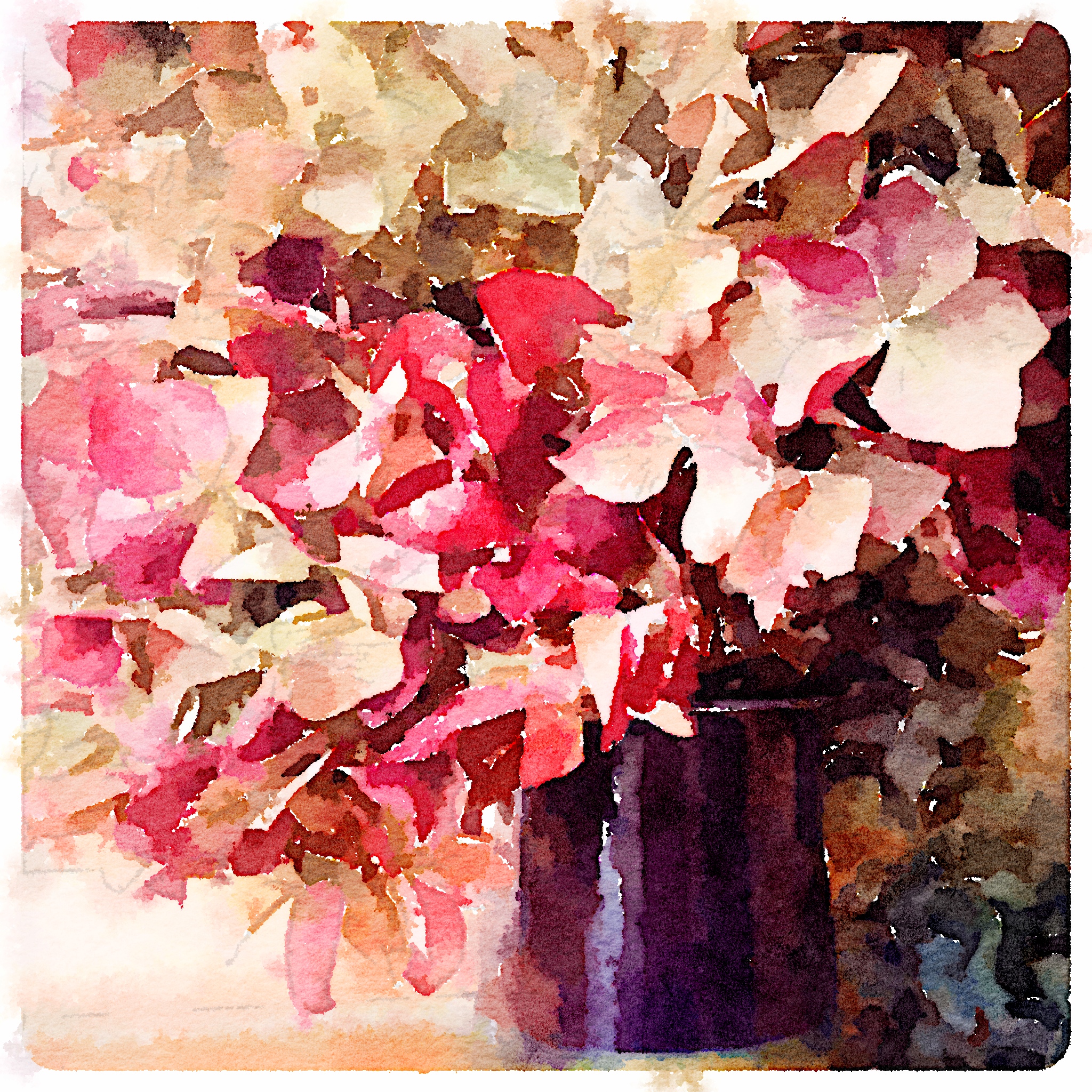
My first attempt was this still life bouquet of dried Hydrangea that some of you might recognize from a post earlier this year.
I think each image has something interesting to offer but would love to hear your thoughts about which you prefer and why.
Posted as part of Lens and Pen by Sally’s Phoneography and Non SLR Digital Devices Photo Challenge.
Both are lovely. Each has elements that draw me into them. The original leads me from top to bottom–the complex to the simple. The processed one gives that painterly effect that works well with floral still life. Happy Photo Challenge.
LikeLike
Thanks for sharing your comments Sally, we are thinking along the same lines today. 🙂
LikeLike
[…] https://nwframeofmind.com/2014/03/31/iphoneography-monday-3-31-14/ […]
LikeLike
Both are lovely. I think the original already has a painterly effect, shades and tones, light and shadows. The processed image is more impressionist art and really pops out the colours. I can’t wait to see more of these 🙂
Jude xx
LikeLike
Thanks Jude, I’ve definitely enjoyed this app and will post more images soon.:)
LikeLike
I really like both of these and am amazed at the quality of the iPhone camera and affects.
LikeLike
Thanks Ruth, I’m amazed every day by what I can do with this phone. 🙂
LikeLike
Very nice. Do you edit those right on your phone or do you transfer them to your computer first (or get them from iCloud)?
LikeLike
Thanks Carrie, normally I like to edit from my computer but this app doesn’t have a desktop version so I work with it on my iPad.
LikeLike
Ah. The iPad has such a sharp screen. I’m sure they look great on there.
LikeLike
Yes it does and it’s a lot easier to see what I’m doing on the iPad rather than trying to work on a little phone screen. 🙂
LikeLike
I think I like the photo best but the way the program translates into watercolour is way superior to Photoshop’s watercolour – now I have something else to try out!
LikeLike
I hope you like using it too and thanks so much for sharing your comments!
LikeLike
I’m with HeyJude. The top has a very Impressionist feel. By the way, I LOVE the Impressionist period.
LikeLike
So do I. 🙂
LikeLike
Beautiful.. I had an iPhone years ago, I loved the phone. Great capture! 🙂
LikeLike
Thanks Andy!
LikeLike
🙂
LikeLike
Both are beautiful. I love the soft watercolor look your app gave the first one! Lovely! 🙂
LikeLike
Thanks Linda, I’m glad you like them!
LikeLike
This water colour effect is just lovely. What does it matter how you get there. It’s a very soothing image.
LikeLike
Thank you Tish and soothing is a great descriptive word for watercolor. 🙂
LikeLike
Lovely!
LikeLike
Thanks!
LikeLike
You are welcome!
LikeLike
Both are lovely but the impressionistic vibe of the first makes it pop a little more for me.
LikeLike
Thanks for your comments Nancy! Side note – did you know you have been my #1 commentator for while now?!
LikeLike
YES!!! #Winning 🙂
LikeLike
Ding, ding, ding!!!
LikeLike
Lisa,
At first I thought the water color edited picture was amazing. But when I saw it compared to the original, my impression changed from “cool” to “abstract”. The software seemed to leave too many white areas on the canvas. But then again, I’ve never been much on impressionist or abstract art.
Patrick
Redneck Garage Art Critic
LikeLike
Thanks Redneck Garage Art Critic. 😉 Plenty of people have strong opinions regarding abstract art, and many feel the same way about impressionism. I’m glad your first impression was a positive one though!
LikeLike
Lisa,
Thanks! You just gave me an idea for a new post…impressionist gear-head art from my garage. I have some photo apps I can play with. Hopefully this will undo the interesting search terms I will be receiving thanks to Nancy.
Patrick the Impressionist Gear-Head
LikeLike
Sounds like fun! And I love Nancy’s search term posts. 🙂
LikeLike
I like the painterly effect of the original, but the watercolour is rather impressionistic!
LikeLike
Thanks Sue!
LikeLike
Both are beautiful. The edited is beautiful, I also like the the colors of the original.
LikeLike
I’m glad you like elements of both Amy. 🙂
LikeLike
I really like the effect. Have to remember to get that app. 🙂 But they’re both lovely.
janet
LikeLike
Thanks Janet, I think you’ll like working with this app. 🙂
LikeLike
I love them both!!! But, if I have to pick and favorite then it’s definitely the first image. I love how the app transformed that bouquet into a watercolor painting. It’s really playful and a joy to look at. Great work! 🙂
LikeLike
Thanks so much Polly!
LikeLike
I love,love, love the Waterlogue edit/processing. I used to have a similar app when I had an iPhone, I’ll have to look for an android version for my Samsung. I think I love this type of app is because I would love to paint…but don’t quite have the aptitude.
LikeLike
I’m right there with you Angeline, I love paintings but have zero aptitude. 🙂 I hope you find an android version of this app, I’m sure you’ll enjoy it!
LikeLike
This is one of my favorite of your posts I’ve ever seen. Love the angle at which you shot this photo in the first place. I just don’t have your perspective! But then the Waterlogue edit made it even more special. It DOES look like a watercolor painting. Love, love, love this. (Would you mind if I pinned it to my Pinterest board for Flowers?)
LikeLike
Thanks so much Rusha, what a nice compliment! Of course you can pin this to your Pinterest board and I really appreciate your asking. 🙂
LikeLike
Love the colors and texture of both of these images! My husband has lots of fun using various apps on his photos (and sometimes mine). It’s always fun to see how they transform. It actually helps me understand how I could paint the image … IF I had time and talent!
LikeLike
I’m glad you like them D’Arcy! You’re right, this app does shed some insight into how you might create a watercolor image from the same scene. 🙂
LikeLike
I’ve posted the Waterlogue version on this Pinterest site: http://www.pinterest.com/rushasams/for-the-love-of-art/
The other one is on my Flower site: http://www.pinterest.com/rushasams/flowers-and-gardens/
Thanks!
LikeLike
Thanks for the links, I’ll take a look!
LikeLike
Absolutely stunning Lisa. 😀
LikeLike
Thanks so much Sonel!
LikeLike
What a gorgeous effect – perfect for a home printed greeting card! But so was the original…
LikeLike
Thanks Sukie, I was thinking the same thing. 🙂 This effect could make some great cards!
LikeLike
Stunningly beautiful images, Lisa. The first one, I could happily hang on my wall. 🙂
LikeLike
This makes me really happy to hear Sylvia!
LikeLike
That’s a gorgeous effect, Lisa! I wouldn’t mind playing with that one myself. 🙂
LikeLike
Thanks Jo, I hope you get a chance to try it. 🙂
LikeLike
I really like how that turned out! This is a pretty cool app… It looks like the one called “bold”. Great job.
LikeLike
Thanks and yes, it is a fun app!
LikeLike
It is a tough choice, I would probably go with the second 🙂
LikeLike
Thanks for your comment and visit Paula. 🙂
LikeLike
I love Waterlogue and I love what you have done with the app in your image-it is just lovely!
LikeLike
Thanks, Waterlogue is so much fun!
LikeLike
[…] https://nwframeofmind.com/2014/03/31/iphoneography-monday-3-31-14/ […]
LikeLike
I love this Lisa, both are great, but the top one really does look like artwork! 🙂
LikeLike
Thanks, Amanda!
LikeLike