Light and dark, tall and short, happy and sad — this week, share a shot that captures a contrast.
Michelle W. – The Daily Post
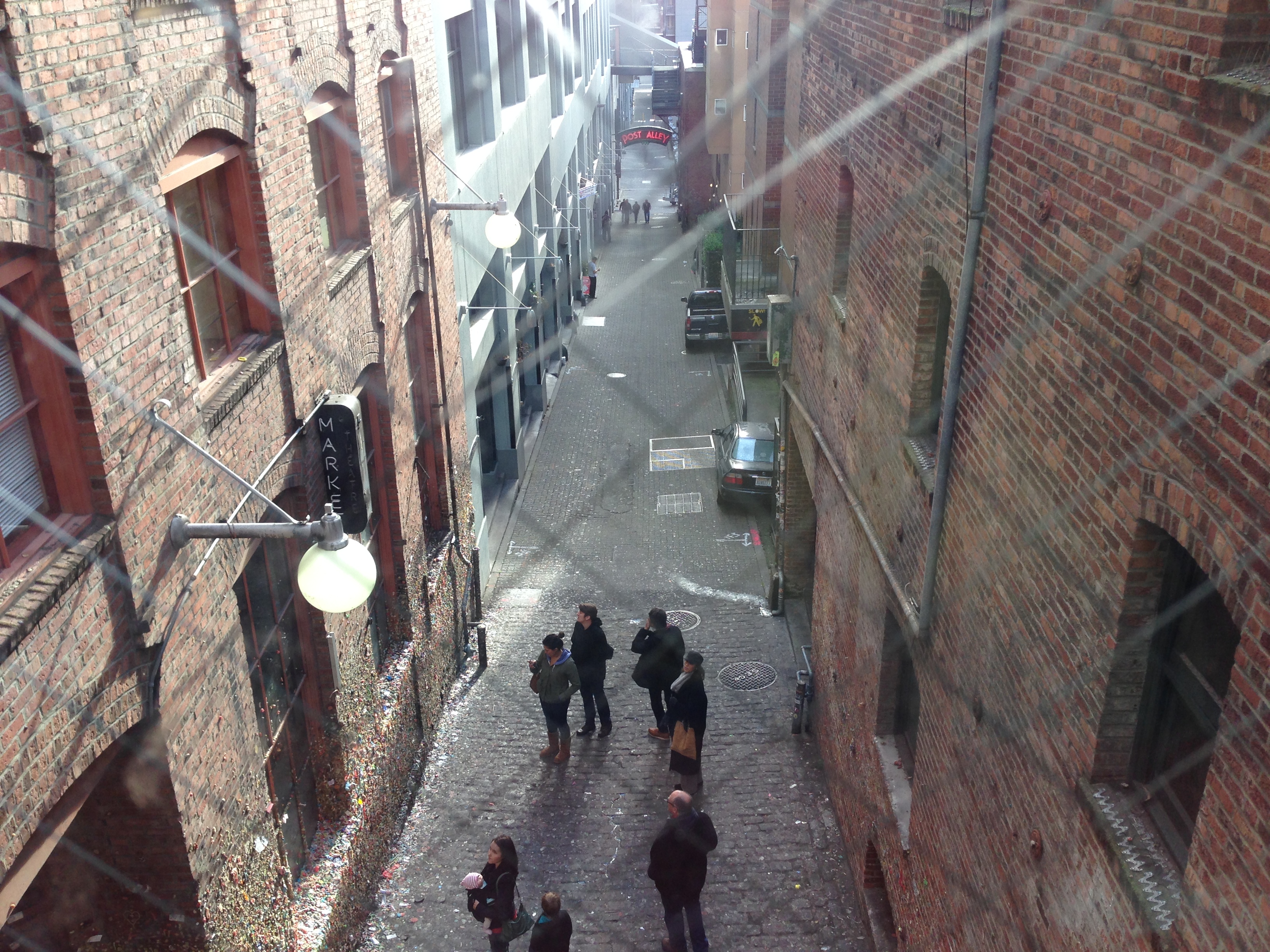
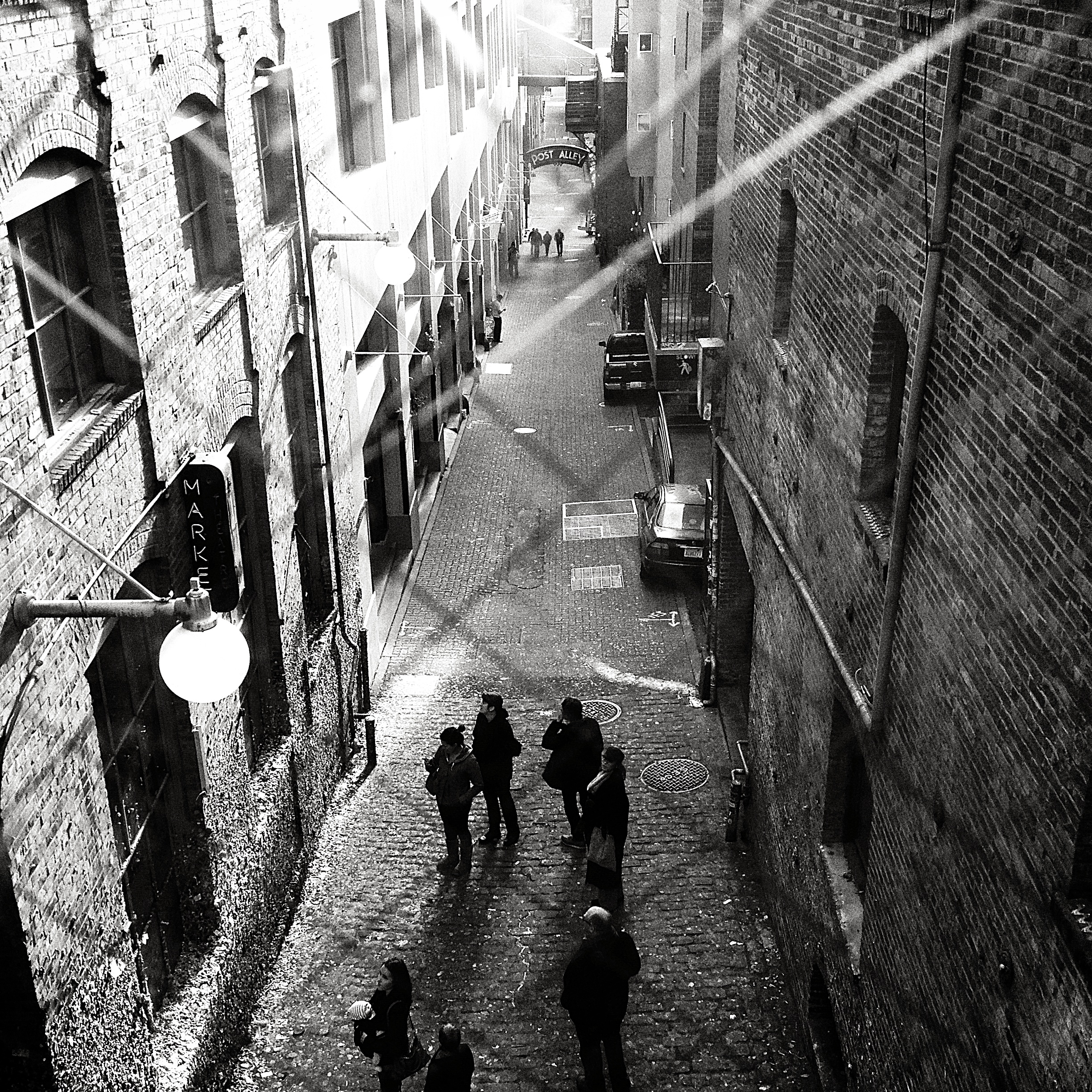
I wrote a Word A Week post about Contrasts a few months ago so today I thought I would take a different approach and show you a “behind the scenes” view of a few photos I took in full color but converted to black and white before sharing them here. I liked the original scenes enough to photograph them and keep the images in my files but when it came time to post I decided the pure light and dark contrasts made for more compelling pictures. Editing is always a matter of personal taste and while I’m happy with the black and white versions I would love to hear your comments regarding their transition from color to monotone.
Before
After
Before
After
Before
After
Wowee. I REALLY love that last one in b & w. They’re all improved, but that last one is gorgeous.
LikeLike
Thanks, Andra! It’s a lot of fun to see how much a scene changes when the color is removed.
LikeLike
I love the alley scene in black and white. Such a contrast! Well done!
LikeLike
Thanks for your comments! I was really happy with how the alley scene turned out and it’s great to know you like it too. 🙂
LikeLike
LOVE the change in each of these photos into black and white – for me each is a totally new capture! 🙂
LikeLike
How fun, that’s the effect I was going for! Thanks. 🙂
LikeLike
love the selections – all 3 have such contrast – 😉 – and the alley one is my fav – I still find myself looking deep into that scene…. and the B & W of the alley make sit seem like a different world – or just very old….. hmmm 🙂
LikeLike
I liked how the b&w treatment highlighted the age of the alley too, Yvette. This is an old part of Seattle’s history, connected to Pike Place Market and it seemed like a good candidate for an older style of processing.
LikeLike
Seattle looks so cool!
and side note, Pike Place Roast is one of my husband’s favorite blends – 🙂
LikeLike
Pike Place Roast is a favorite here too. 🙂
LikeLike
In these photos, I think the color distracts from the flow of the shape lines. Your instincts are good. You moved them from nice, but ordinary, to something special.
LikeLike
Thanks, Jim I appreciate your thoughtful comments. I try to look for images with strong lines when searching for black and white candidates and it’s nice to hear those elements have translated successfully to viewers who aren’t as close to the originals as I am.
LikeLike
I prefer them all in black and white – and I’m loving seeing what you’ve captured of Seattle!
LikeLike
Thanks, it’s so nice to hear my first choices were good. 🙂
I’m glad you are enjoying my views of Seattle, I really like seeing familiars views through a new pov too. 🙂
LikeLike
Love the black&white version of them all.
LikeLike
Thank you. 🙂
LikeLike
It’s amazing to see how much the mood of the shot changes!
LikeLike
I agree, what a change!
LikeLike
With these subjects the black and white are more striking.
LikeLike
Thanks, Seeker. It’s nice to know you like them.
LikeLike
2nd shot after is better 🙂
LikeLike
Thanks!
LikeLike
I like your alley scene…perfect subject for B&W! 🙂
LikeLike
Thanks so much, Sue. 🙂
LikeLike
🙂
LikeLike
Exceptional …
LikeLike
Thanks, Isadora!
LikeLike
I think the alley shot is so much better in black and white. The top criss cross lines of the wire look like shafts of light at first and help to create an amazing atmosphere.
I can’t decide about the second picture – it is just different and does work well in black and white too, but then you lose the red colour which is the highlight of the colour version. The grains in the wood show up better though.
Again I think the third picture in black and white has an impact that the colour version lacks. You lose the distraction of the people in colour on the balcony and your eye is drawn down the line of balustrades to the light area at the end. I missed that in the colour photo.
Gosh you would think I knew something about art wouldn’t you???
LikeLike
Great recaps, Annette! I agree with every point and when I mentioned I like the originals too I was really referring to #2 because even though I think b&w works for it I didn’t want to give up the red. 🙂
Lisa
LikeLike
Nicely processed images! I think my favorite might be the shot of the street from above. The high contrast really seems to work well, and there is a lot of visual interest. Great stuff.
LikeLike
Thanks so much, Shane. Coming from you this is a great compliment!
LikeLike
Anytime 🙂
LikeLike
Great shot! And have to say – I love the “contrasts” in life… 🙂
LikeLike
So do I Kamila. 🙂
LikeLike
I like your black&whites Lisa. I love the way you captured and edited it.
LikeLike
So nice to hear Paula, thanks!
LikeLike
You’ve nailed it. Love this perspective.
LikeLike
Yay! Thanks Rusha!
LikeLike
Lovely changes into black and white, and they all work really well, but I especially like the two street scenes, the contrasts between light and shadow 🙂
LikeLike
Thanks so much, Seonaid. 🙂 Street scenes usually seem best to me in b&w too even though I take most of them in color.
LikeLike
Okay, second time this has happened to me. At first I just thought you might be in vacation but then I got curious and typed in your URL. Nope. You’ve been posting, but they haven’t been appearing in my Reader. So then I look at my Blogs I Follow list and yours is no longer listed. WTF, WordPress?? How does it just unfollow people? Now I’m paranoid about who else might have disappeared off my follow list. 😦
LikeLike
Oh no! It’s happened to me before too… thanks so much for trying to find me. At least now I know if I disappear there is a chance for an international search party! I will be off for a few days vacation next month but will give everyone a heads up first. 🙂
LikeLike
So flippin’ frustrating that the system can somehow unfollow people on my behalf. I am glad I figured it out juju at a few days in and not two weeks later!
LikeLike
Me too!!! I have a love hate relationship with the reader… while it is so convenient to have everything pulled together in one place I know it doesn’t always show me posts from everyone I follow. The thought of managing who I follow through emails though is too overwhelming to think about, my inbox would explode. I do have a list of bloggers I check on if I don’t see a new post after a few days and you’re one of them. 🙂
LikeLike
I feel the same way about following by email. I grow an ulcer just thinking about it.
LikeLike
Yep, I can’t handle leaving unanswered/unread email in my inbox and when that reminder number reaches triple digits I’m a mess. It’s enough to convince me to stick with the reader. 😉
LikeLike
Lisa,
I find that some photographs tell the story better in black and white. This may have something to do with the structure of our eyes. In full light we see color but when it becomes dark we see only light and dark. To take this thought to a theological level, it may also have something to do with the battle between light and darkness. In the alley scene, the black and white photograph made me believe it was night (our eye structure of cones and rods) which made me think of my safety. The color photograph shows that there was still daylight making the ally an interesting place to explore. All three of these photographs make the story more interesting.
Patrick
LikeLike
What interesting points, Patrick thanks for bringing up the structure of our eyes and light and dark. There are so many parallels to explore here but in the end I must say while I love bright colors I’m drawn to black and white for photography. I focus on the subject more and less on the decorative elements.
LikeLike
I would agree Lisa. Black and white photography is more focused on the subject. It also takes away the difficulty in capturing the true colors due to the lighting conditions.
LikeLike
[…] Northwest Frame of Mind Weekly Photo Challenge: Contrasts […]
LikeLike
Lisa, one and three are, to me, improved by going to B&W. They both look more dramatic and in the case of the first, more dangerous. However, I prefer the second in color because I think it loses something without the color. No matter; well done all around.
janet
LikeLike
Thanks for sharing your thoughts, Janet. I like the color in the second one too and remember converting it to black and white as an experiment for one of Sally’s Monday challenges. Now I’m happy I’ve got both versions to enjoy. 🙂
LikeLike
Thanks for the lesson. 🙂
LikeLike
You’re welcome, Jennifer. 🙂 Thanks for the visit!
LikeLike
Hi Lisa, I hope you won’t mind but I am going to do something similar for my entry for Contrasts as I have no suitable black and white photos to use – I will credit your idea. Actually, have you thought about using this idea as a monthly meme that we can all join in. It is really interesting looking at the difference between the two photographs of the same scene and we would certainly learn a lot more about what should be taken in black and white in the first place. I love black and white photographs, but never think about taking them myself.
LikeLike
Hi Annette, It’s great to hear you like this idea well enough to do a post along the same lines! There are a few fun blogs in this community that have weekly before and after challenges but I don’t think I’ve seen one that focuses strictly on black and white. You may be on to something. 🙂 I’ll keep it in mind for when my 1D1W project is complete in October and maybe we can start a new series for the next six months. Thanks!
LikeLike
[…] on from Lisa’s idea, on NorthWest Frame of Mind, of showing a black and white photo followed by its original colour version here is my […]
LikeLike
Clever take on this!
LikeLike
Thanks. 🙂 I wanted to try something new and it’s great to hear you liked it.
LikeLike
These images are a perfect response to this challenge. The texture and lines of the black and white versions grab my eye.
LikeLike
Thank you, Cindi. 🙂 It’s great to hear such nice feedback when I try something new for a challenge.
LikeLike
the alley scene is awesome in bw!!
LikeLike
Thanks, Alexandra!
LikeLike
I really enjoyed seeing the difference between color and black and white! You’ve inspired me to experiment a little more with my own editing options. I love the b & w because I think there’s a bit more drama, but that’s achieved because the shadows are more pronounced. Really nice. 🙂 Debra
LikeLike
Thanks so much, Debra! It’s great to know you’re feeling inspired to try some new editing choices now. 🙂
LikeLike